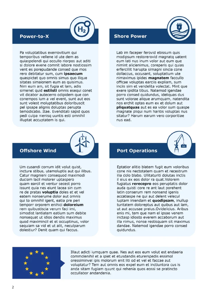
Nice to see you here! I’m Charlotte an illustrator, 2D animator, designer, photographer, and creator; with a love for visuals. I thrive on ideas that carry a story, whether it is a personal portrait, an entrepreneur’s identity, or a playful illustration.

I mostly work on commission, love to think and create together and believe that any subject can end up as a great final product, which will put a smile on your face.
Why collaborate?

Creative Solutions

I nature your vision, turning ideas into stunning designs that truly stand out. There is always a way to make it work.

Tailored Approach

I nature your vision, turning ideas into stunning designs that truly stand out. 

Continuous Support

I’m with you every step of the way, ensuring your projects stays on track and meets your wishes. Feedback possibilities throughout.

You have an idea

Send me a message with what you are looking for, it may be rough or just very concrete.

Lets discuss it

I ask questions, listen carefully, and help think about the outcome of your ideas.

Receive a proposal

You receive a proposal which says what I will make for you, how long it will take and what it will cost. So, you know exactly what to expect before we start.
I get to work

In the meantime, you will get regular updates as the project takes shape.

Results

Your input and my creativity shape the final result, with room for feedback and a revision.

Delivery

 After your approval, I complete the work and deliver it digitally (or printed, in consultation).

A glimpse into my milestones

From my first steps to becoming a designer, each milestone marks a step of evolution and becoming better. I love to grow and I think this timeline shows my passion for design and visuals in a pretty broad way. 

Start of the journey

My creative path started at an early age, at just four years old I was already writing that I wanted to be a designer. Not surprising with a family full of creative souls. My academic journey started with Product Design at the HKU and ended with a master’s in Design Cultures at the VU. 

Art academy

My academic background started with the bachelor Product Design, where I learned to approach design in terms of material, function, and process.

Some jobs in between

In the meantime, I had jobs at IKEA as a Kitchen Specialist (design and sales) and at Piet Hein Eek’s restaurant. Both places have been hotbeds of creativity for me, where designs arose every day.

Master time

During my master’s, I focused more on the theory behind design in society. So, I learned about the past, present, and future in the fields of fashion design, architecture, game design, and more. I completed the master with a thesis on the female outfits of protagonists in game design. 

Currently

Meanwhile, my focus is entirely on illustration and visual design; with a style that is clear, warm and, authentic.

Nowadays, I draw and design full-time. I believe making something beautiful starts with listening carefully and getting started with pencil and paper.

Lets bring your idea to life!

Lots Visuals is a creative design studio for illustration, branding, and animation. Battling the boring so you feel authentic and unmistakably yourself.
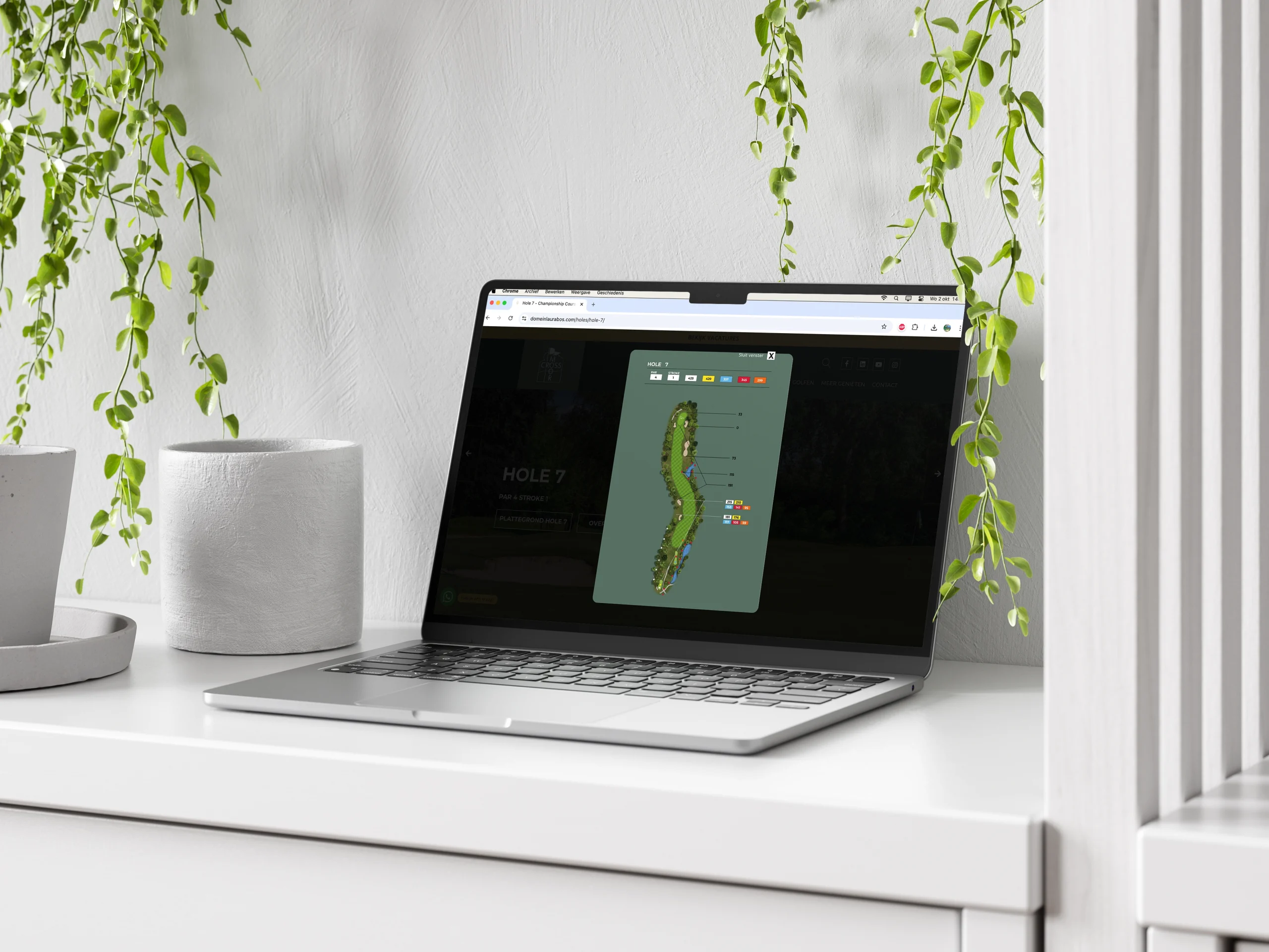
Course plans for all eighteen holes at Crossmoor Golf Course in Weert, developed using photos, drone footage, golf regulations, and the club's brand guidelines. The background colour of the plans matches the backdrop of the club's logo, and the flag from Crossmoor's logo is used to mark the hole location on the green, keeping the design practical, consistent, and recognizably on-brand.

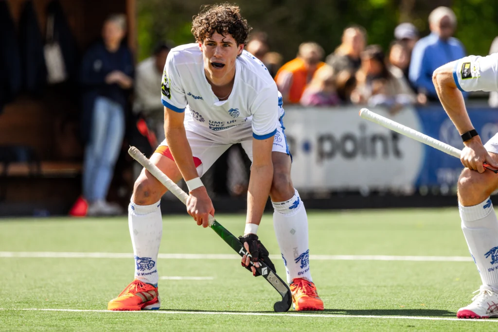
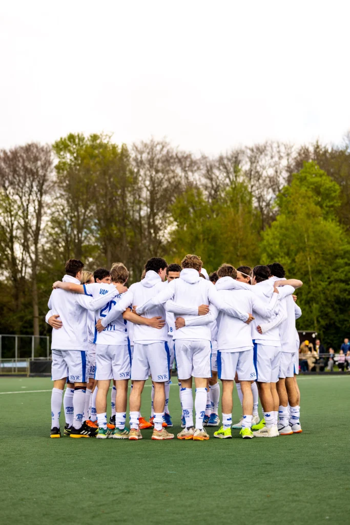
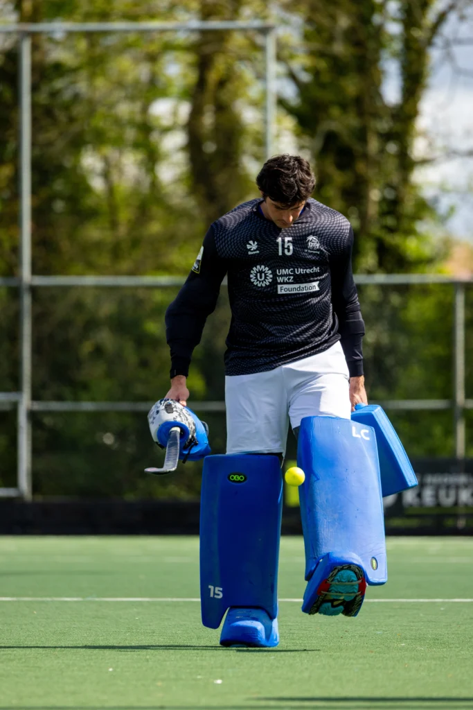
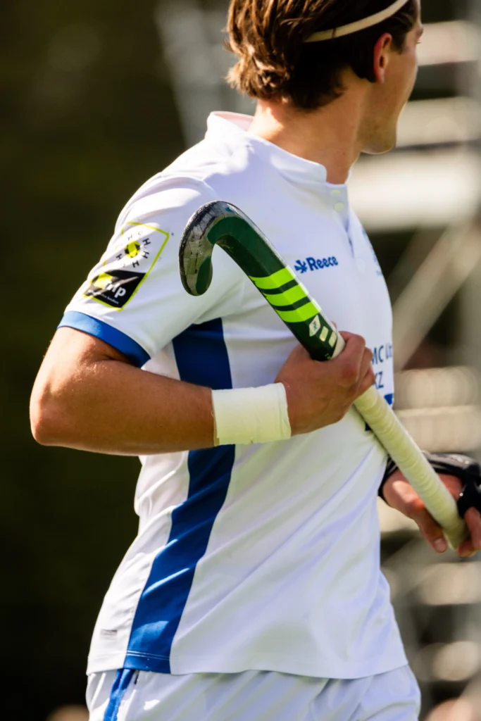
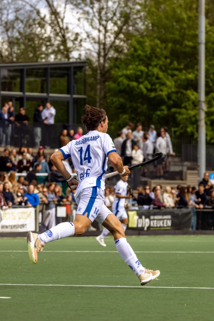
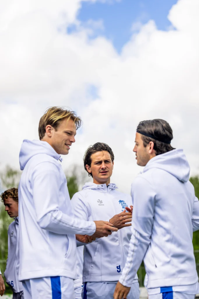
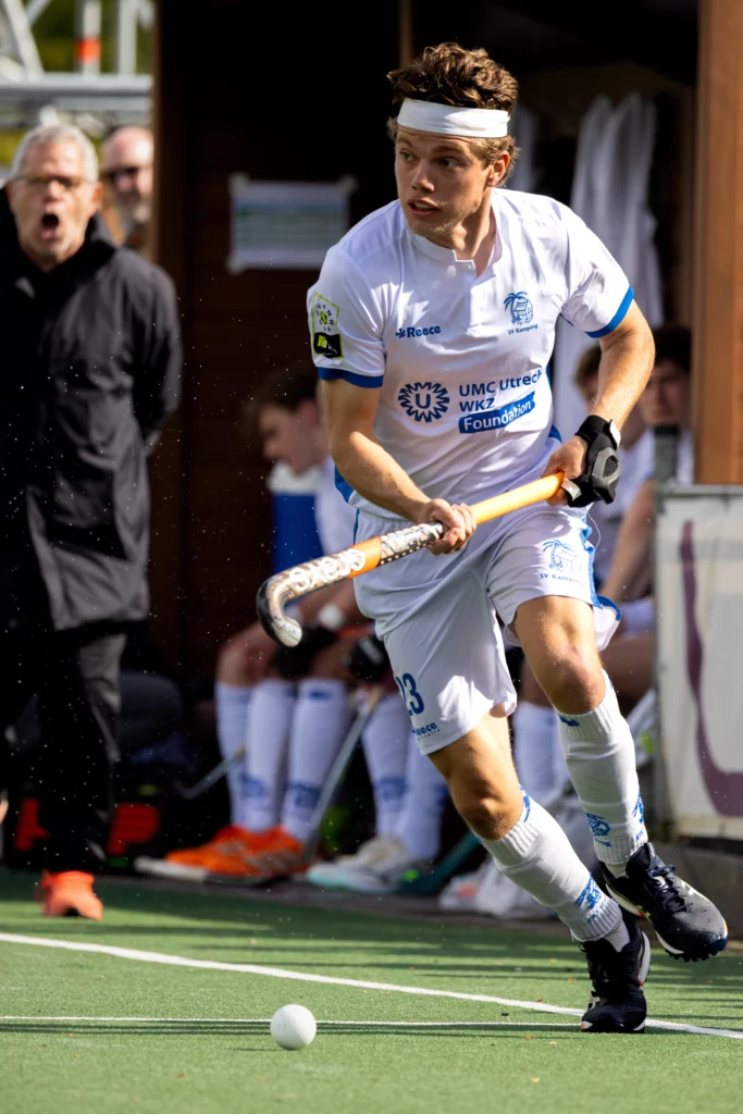
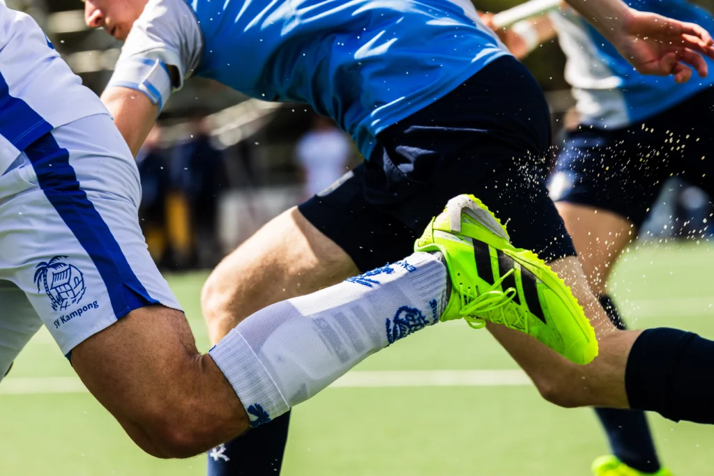
Sometimes the best way to grow is to just get out and shoot. I joined a photographer to cover a hockey match of the first men's team of SV Kampong partly to improve my skills and sharpen my eye for fast-moving, unpredictable moments, and partly because I genuinely love the sport. A combination where two of my passions came together, and a great excuse to spend a day doing exactly what I enjoy: watching a good game while capturing it through the lens.

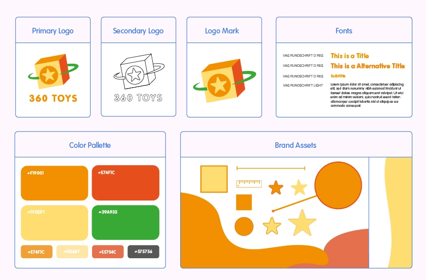
A complete visual identity, from first concept to finished brand. The project follows the full logo design process, exploring directions, refining shapes, and landing on a mark that reflects the client's brand values and speaks to their target audience. Alongside the logo, a brand style guide was developed to bring everything together into a cohesive and recognizable identity.

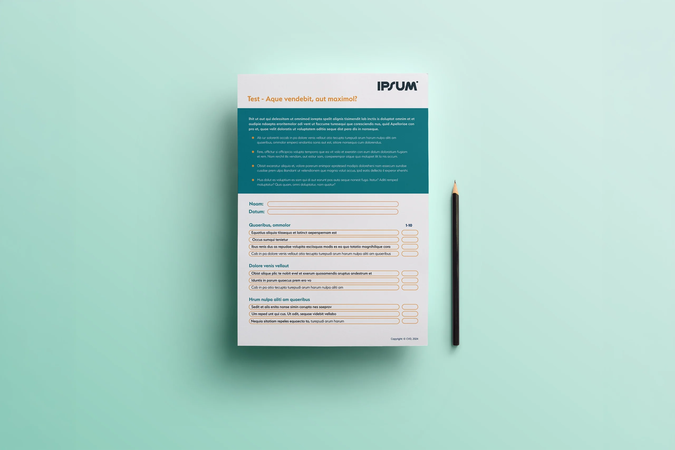
Annual review conversations work best when both sides come prepared. This document gives healthcare workers a clear framework to reflect on their past year: achievements, challenges, and the goals they want to work toward. The structure is straightforward and easy to follow, ensuring employees and managers are aligned before the conversation even starts.

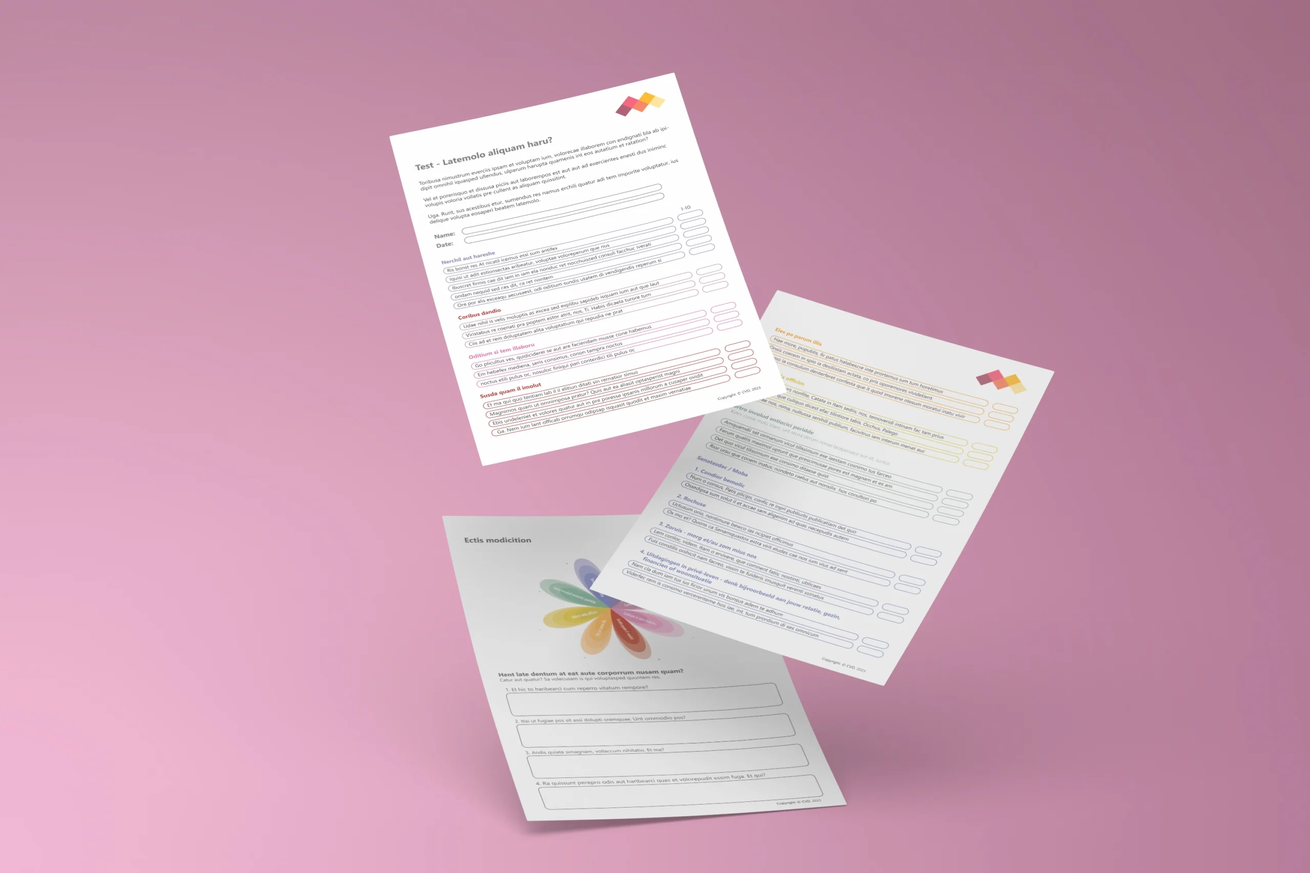
A workplace efficiency survey designed for nurses, tailored to the client's predominantly female audience. Due to copyright restrictions, the actual survey content cannot be displayed. The focus for this project was on creating an engaging and visually appealing tool that felt considered rather than clinical. Thoughtful design elements transform the survey into something worth filling in, not just a form to get through. The survey was built as a fillable PDF in Adobe Acrobat, with each section feeding into a larger outcome: the results are extracted and combined into a flower shaped graphical representation, turning collected data into a unique visual format.

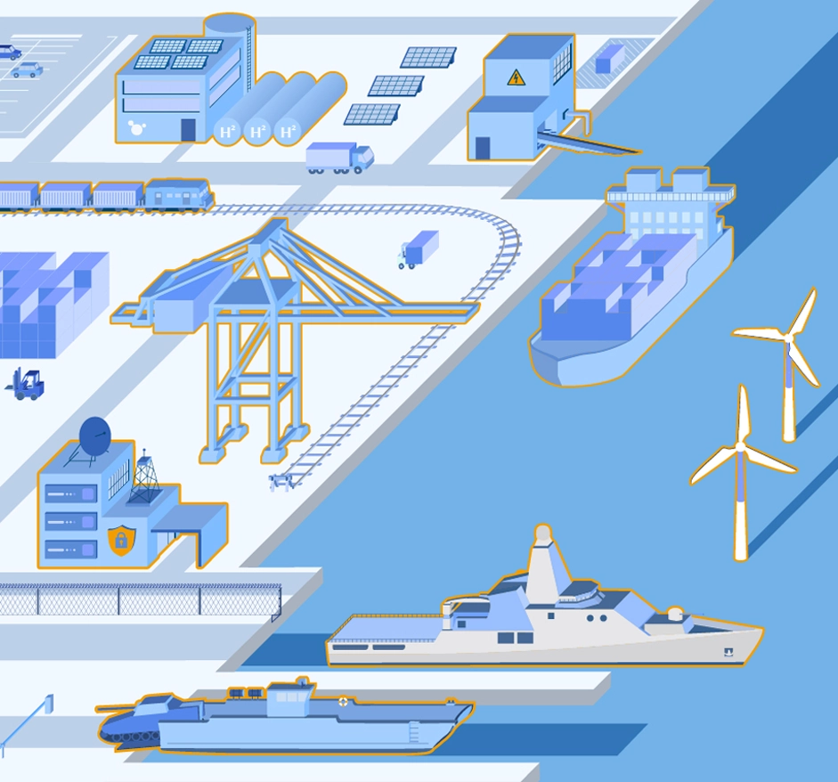
An infographic on port infrastructure in the Nordic region, created as part of reports and a presentation, commissioned by the Dutch embassies in Norway, Denmark, Sweden, and Finland. The design not only focused on presenting complex information in a clear and visually appealing way but also functioned as an animated infographic for use in presentations and at events.

Following the logo and brand identity, 360 Toys needed product listings that would hold up across online sales platforms such as Bol. These templates translate the visual identity into a repeatable format, keeping every product recognisably part of the same brand. Bright, cheerful colours reflect the playful character of children's toys, while a clean and well-structured layout keeps the design professional. Together they make the listings engaging and easy to navigate, without overwhelming the viewer.

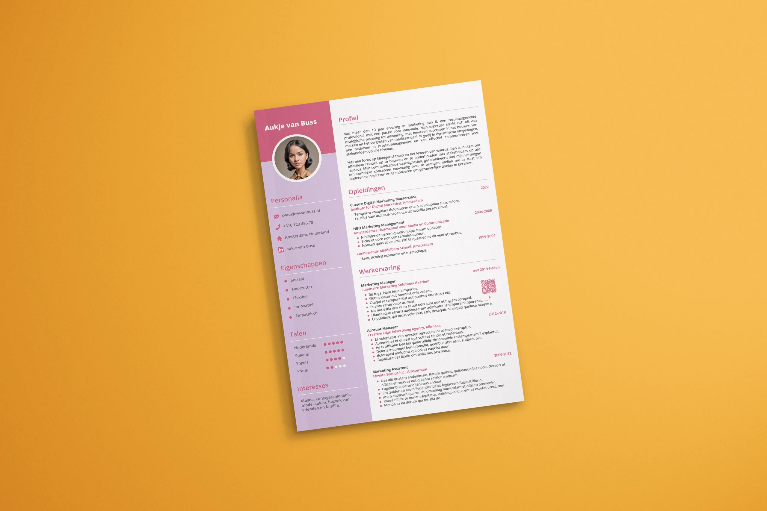
Resumes designed for individual clients, each with their own job field, personality, and personal taste. Working with a variety of people and backgrounds makes every resume its own design challenge, and that variety is what keeps it interesting.

Product listings for 360 Healthy Lifestyle on Bol.com, covering a range of products across the catalogue. Each listing was designed to showcase the product through ambience shots, close-ups, USP images, and infographics, built to engage and persuade. The work contributed to a measurable boost in sales. Highlighted here are three products: an Oat Jar, a Sourdough Set, and a Book Stand.

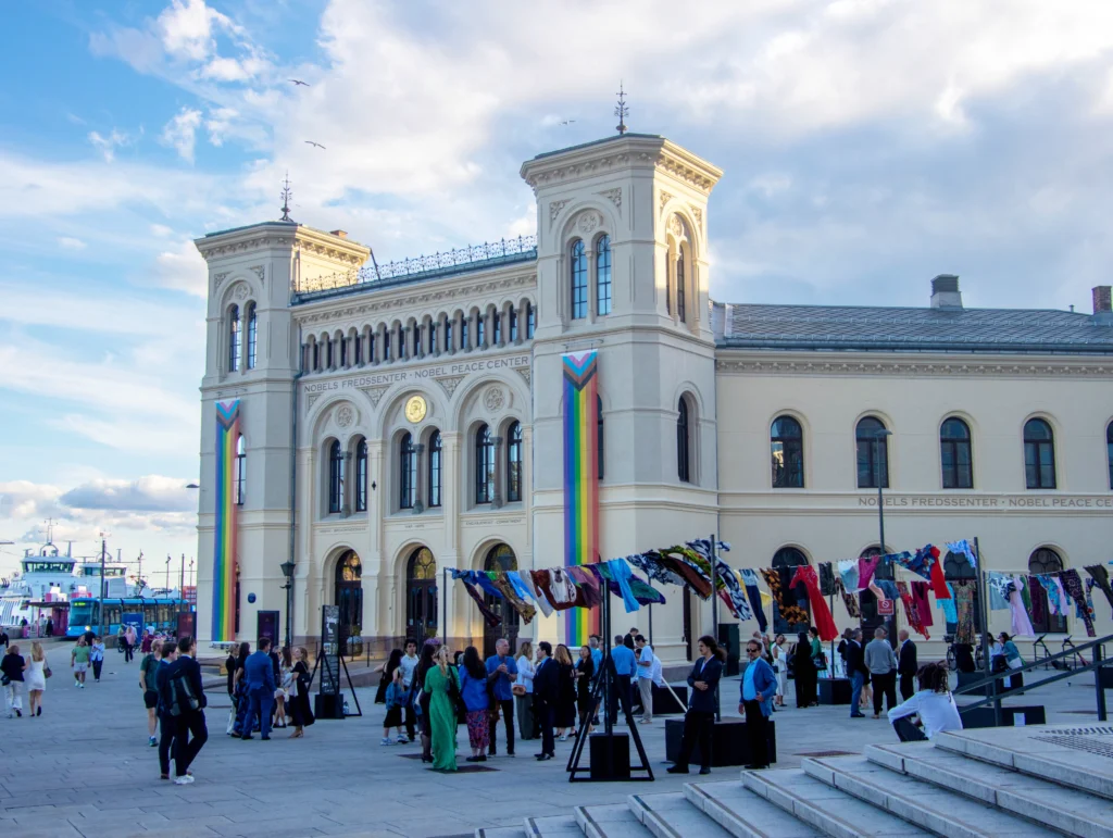
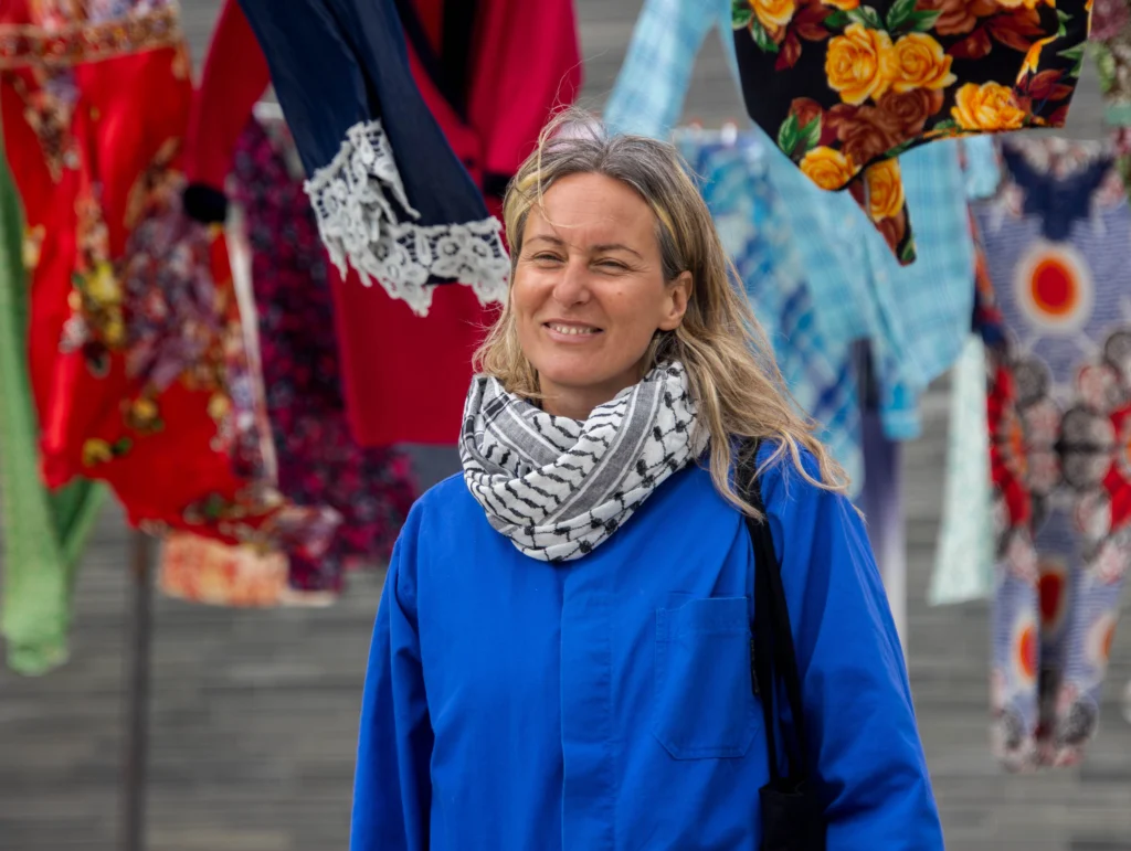
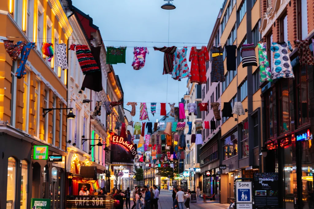
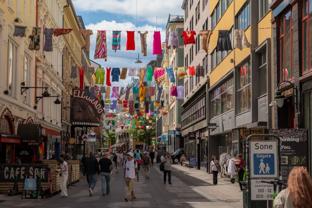
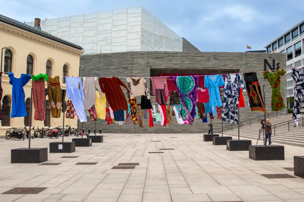
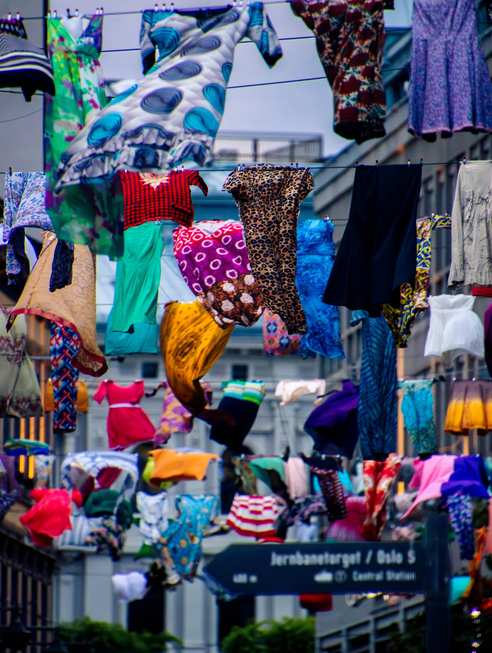
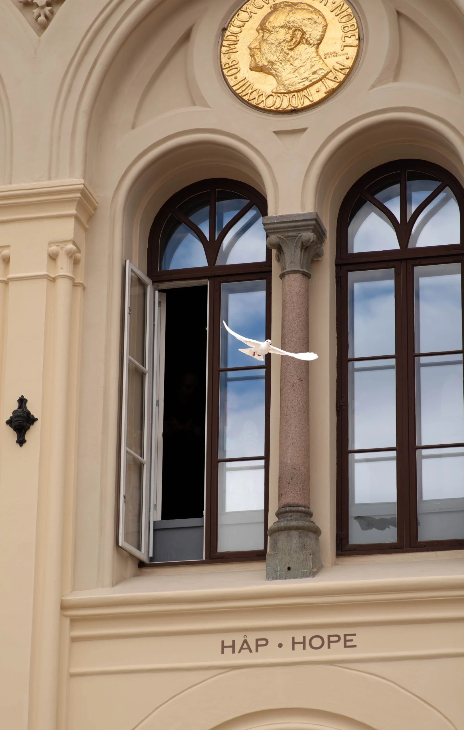
I photographed the installation “Thinking of You” by Alketa Xhafa Mripa in Oslo. The installation is presented at two locations: next to the famous Nobel Peace Center and at Torggata in downtown Oslo.

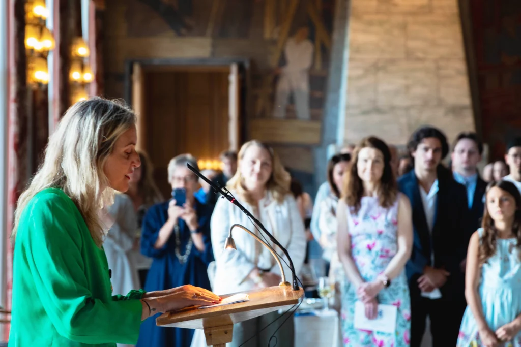
The assignment covered two beautiful events: the official inauguration of the work and the opening of the installation at the Noble Peace Center. In between taking over 5000 photo’s, I had the opportunity to meet so many beautiful, inspiring people. But most of all, I was impressed by Alketa’s work: a dedication to survivors of sexual violence in conflict and beyond.

Such a meaningful thing to be a part of the past few days. So thankful that the Embassy of the Netherlands in Norway and Alketa Xhafa Mripa had their trust in me.

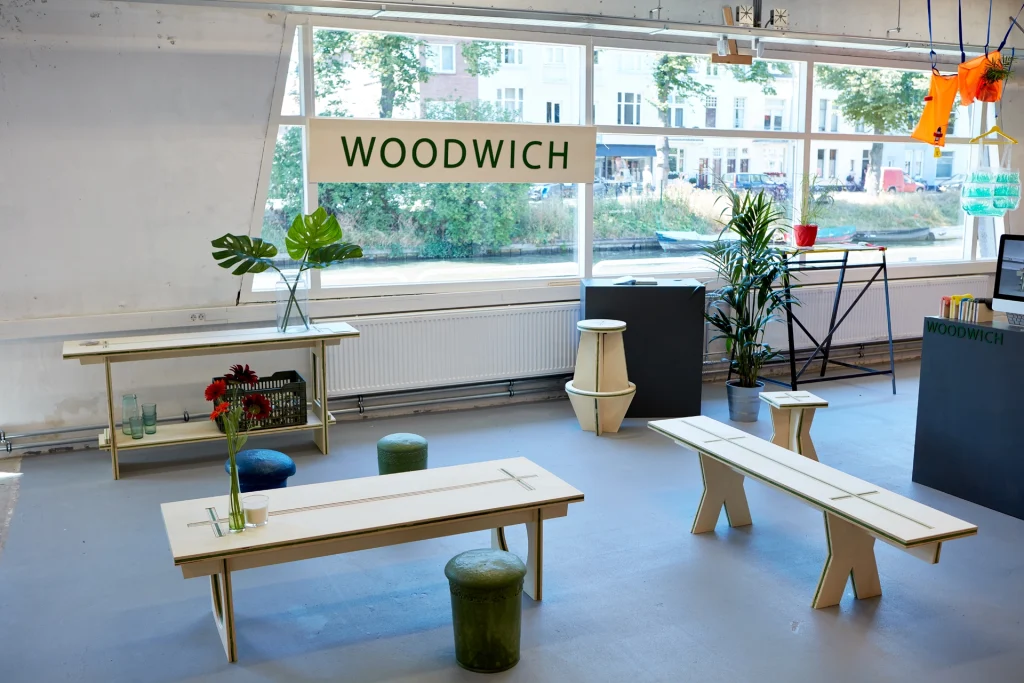
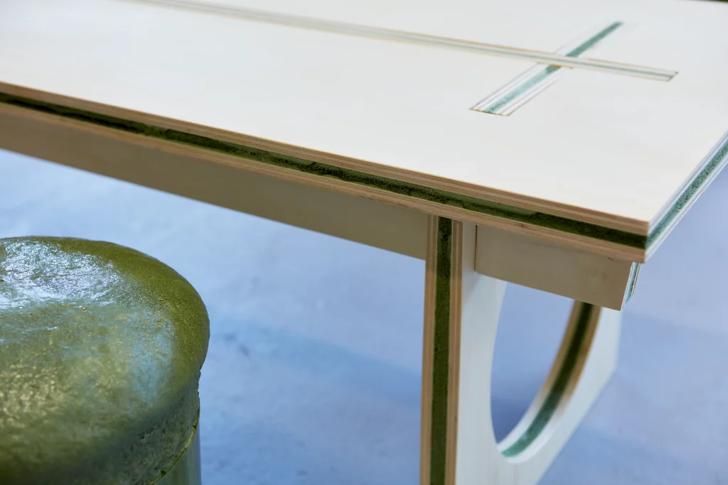
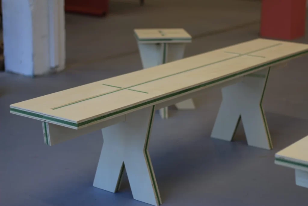
Woodwich is a furniture collection crafted from a self-developed plate material. The design collection is inspired by a screw-free building kit, which offers easily handled products that effortlessly assemble. Enhanced by a lightweight middle layer, the collection is convenient for transport and envirenmentally conscious. The plate material is sustainable and recyclable. Woodwich is an inexhaustible source of possibilities for home decoration, where thoughtful design meets practicality.

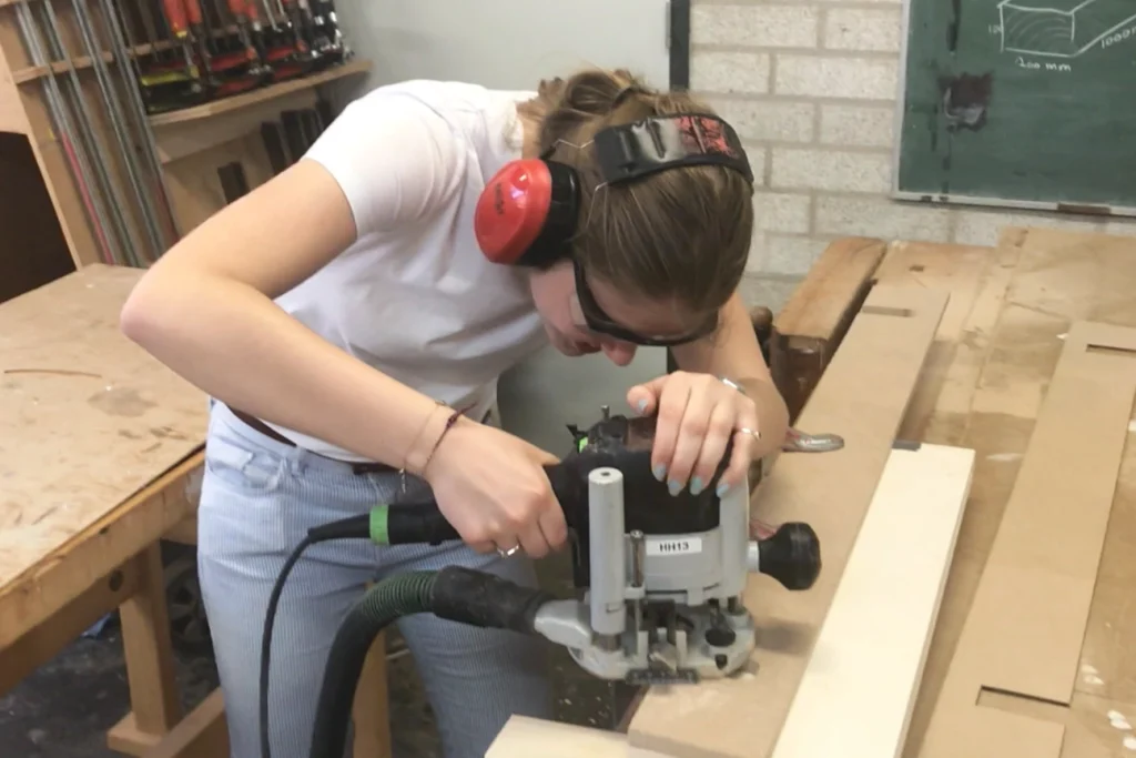
The design process for Woodwich began with the concept of mini-mising waste and material usage while creating a functional product. I began with material research, focusing on lightweight, preferably flat materials. Ultimately, I developed my own solution, a combination of wood and polyurethane foam, resulting in a product that is both light and strong. Transitioning from 2D to 3D, I had to ensure the flat material could be adapted for various applications without the need for screws. I explored different product possibilities by creating small prototypes using MDF. For the final product, I crafted laser-cut moulds, shaped from the plate material, which I then used to form the completed designs.

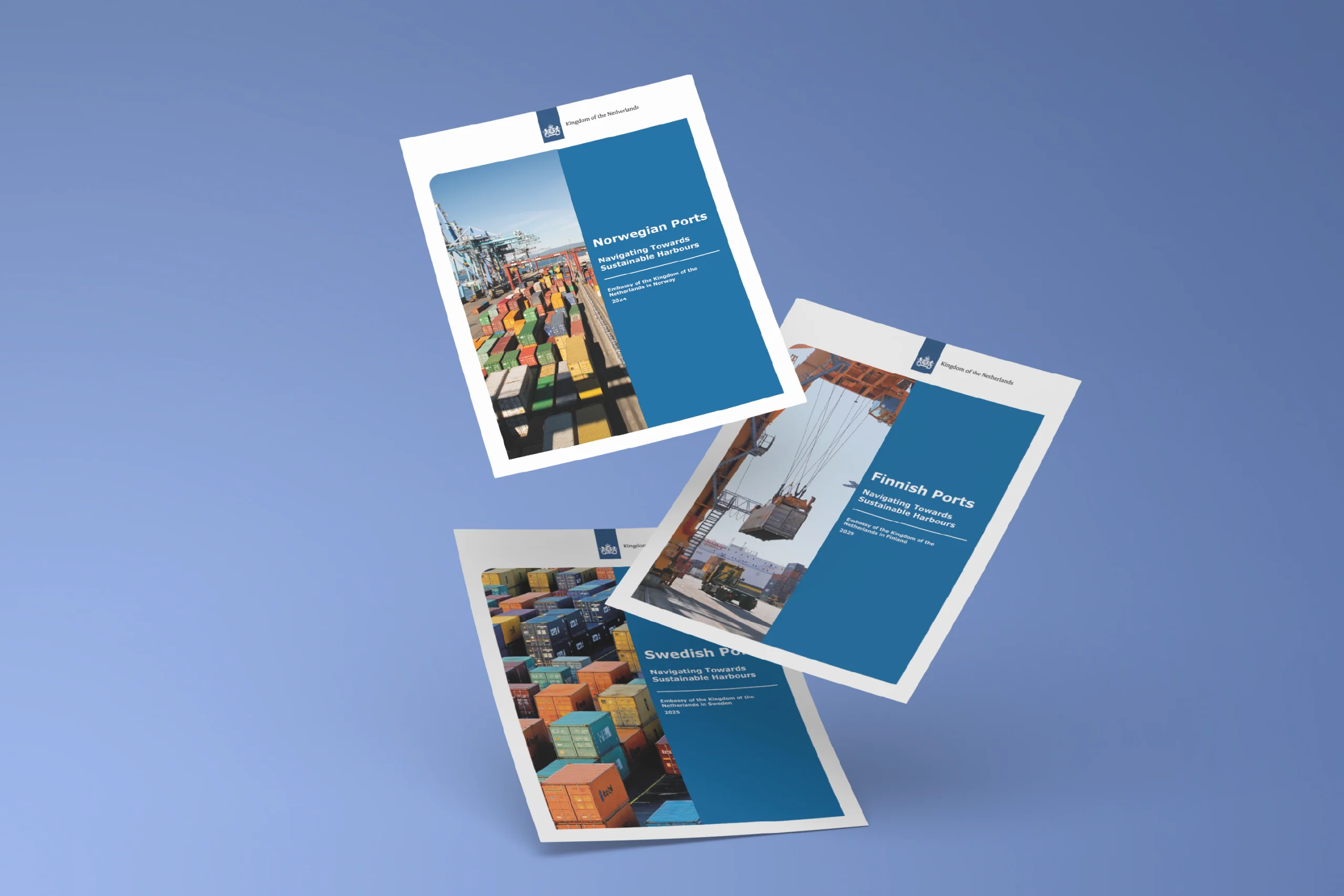
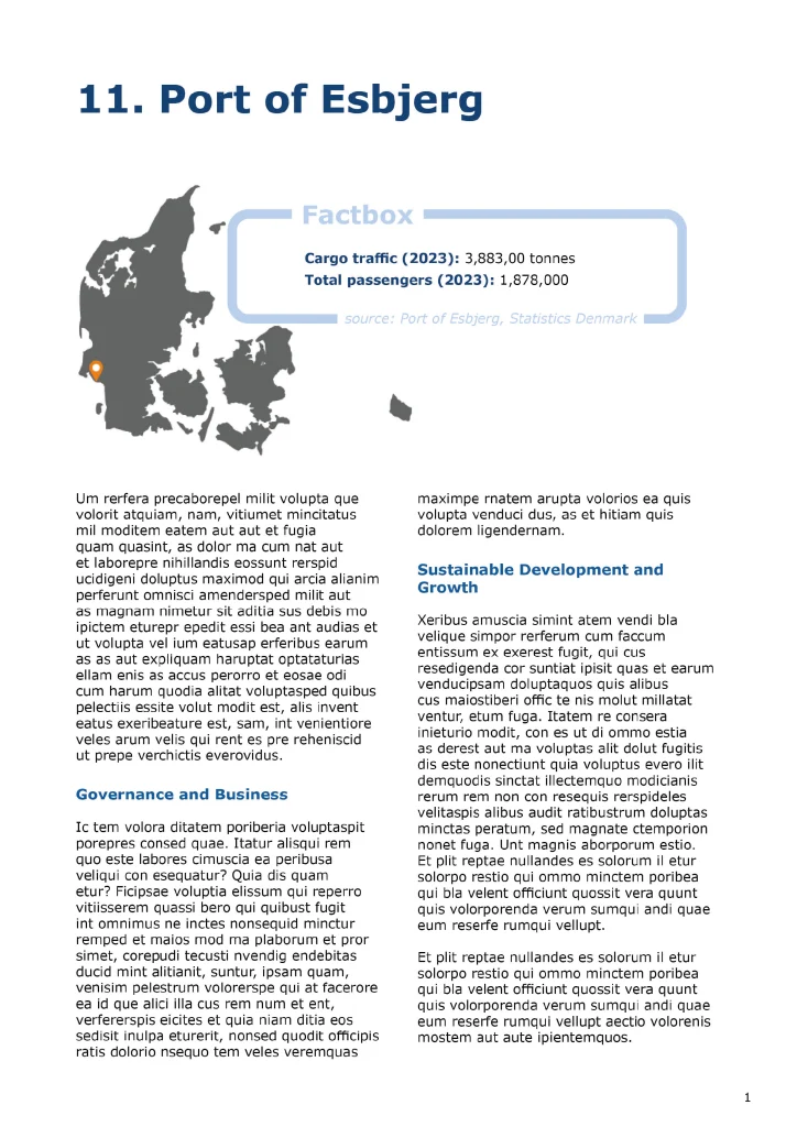
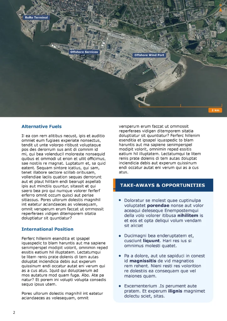
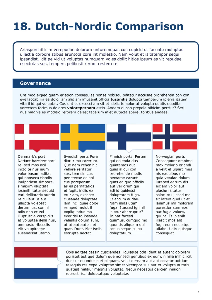
Commissioned by the Dutch embassies in the Norway, Denmark, Sweden, and Finland four reports were designed on the ports in the Nordic region. The design not only focused on presenting complex information in a clear and visually appealing way but also adhered strictly to the official governmental design guidelines.